
revisit
Team Lead, Design + Front-end
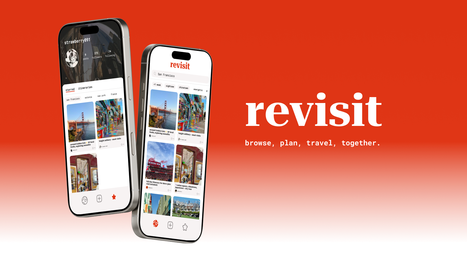
In my Human-Computer Interaction class, my team and I solve the hassles of coordinating group travel through revisit, a social app where users explore real, community-curated itineraries and create their own. revisit is developed in React Native and Node.js.
Team
2 Designers
3 Frontend engineers
Duration
10 weeks (Sep - Dec 2024)
Project Context
What is the problem with group travel planning?
Group travel is messy:
No one wants to be the sole planner
There’s no central hub for trip inspiration
Agreeing on a destination is hard
Solution
revisit
With revisit, get your plans out of the group chat and turn travel ideas into collaborative itineraries — easier, faster, and all in one app!

For our challenge of “Designing for Movement,” we used Crazy 8’s
to brainstorm ideas and chose travel as our focus because it felt both exciting and inefficient from personal experience.
We conducted 2 rounds of interviews with 5 diverse travelers. Speaking with participants in natural contexts like cafés helped us surface common frustrations: one person always becomes the default planner, inspiration is scattered across platforms, and groups struggle to agree on destinations.
Problem space
User Research
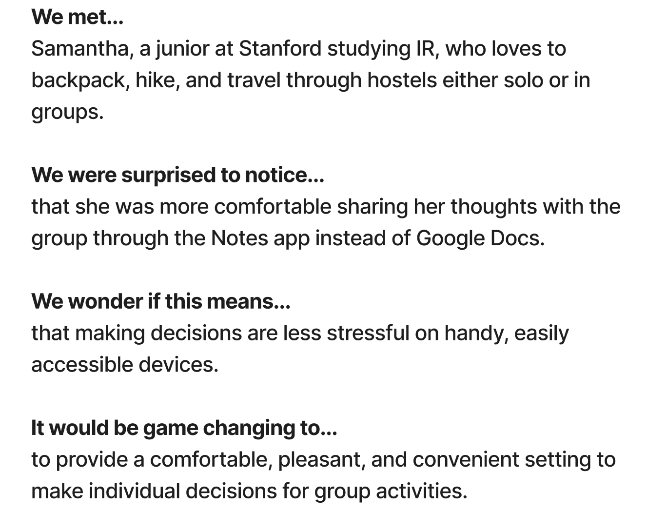
After synthesizing our interviews into empathy maps, we created POV statements for three participants: Ethan, Samantha, and Jensen. Their diverse backgrounds, ages, and travel styles helped us reframe our insights and ensure our design addressed the needs of the most extreme users.


Problem space
POV Statements
After creating POVs, we brainstormed 12 HMW statements for each interviewee to push our thinking beyond obvious solutions. As a team, we voted on the most thought-provoking prompts, narrowing each set to one top HMW to guide ideation. We then generated solutions for each and selected the most innovative and relevant ideas to move forward.


Problem space
HMW Statements & Solutions
From our prototypes, we learned that travelers value inspiration, personalization, and flexibility in the planning process. To meet these needs, revisit supports three core tasks at varying levels of complexity:
Simple: Searching for itineraries
Users browse a library of curated and peer-created itineraries to overcome the cold start problem. They view comments and feedback on activities, making planning less overwhelming while fostering community.
Moderate: Generating and sharing itineraries
Users generate a tailored itinerary and share it with friends, streamlining collaboration and ensuring alignment. This reduces the chaos of scattered communication and conflicting ideas.
Complex: Editing Itineraries
Users edit plans by adding, removing, or modifying activities and destinations. This ensures flexibility and personalization, allowing travelers to tailor trips to their unique interests and constraints.
Solution space
Core Tasks
Before wireframing, we created a concept video to clarify revisit’s core tasks and user value. Starting with storyboards, we illustrated key travel scenarios and translated them into a short video. This step aligned our team on the problem space and ensured our design decisions were guided by user needs rather than interface details.
Solution space
Concept Video
To validate our concepts before investing in high-fidelity design, we built a paper prototype to test our core tasks.


Testing on random strangers on campus, we gathered the follow insights:
Swipe-to-Choose Interface
Finding:
Many users recognized the swipe format from dating apps, which made the action intuitive. However, several believed swiping matched them with another user rather than an itinerary.
Decision:
We replaced swiping with a feed view that allowed users to view many itineraries at once.
Housing Selection
Finding:
Including housing options created confusion and felt irrelevant to itinerary planning.
Decision:
We shifted focus to day-to-day attractions and activities, which is at the core of exploring a new place!
Solution space
Low-fi Prototype
We used these insights to transfer our low-fi prototype onto Figma:


Solution space
Med-Fi Prototype
To further test our prototype, we conducted an heuristic evaluation with another team. After consolidating 75+ violations into 25 key violations, we made the following key changes:


Solution space
Heuristic Evaluation
Tada! Here is the final prototype.
One of the biggest challenges I faced when coding revisit up was wiring the pages together. I found all edge cases in which a user would want to click on their profile and ensured that each click would direct them to where they wanted to go.
Solution space
High-Fi Prototype
This was the first end-to-end app I’ve created and I don’t think I have ever learned so much in a quarter! I am so grateful for the friendships I made with the team and how we went from strangers to the best work buddies. Building revisit has also proven to me the scale at which I can build for impact, and it was especially rewarding when an investor came and said that he would totally invest in our app!
Now, I plan to retackle the problem of group travel by building this up through vibe coding. There are so many more nuances that can be covered with efficient building and testing.
Overall thoughts